IWP has over 200 sets of water data online. Of this, we have converted around 16 to an Excel format and will be adding more in the coming weeks for you to download. Use our Data Finder, a search tool for finding water data online, to search for this information.
There is a lot of water data available through different government and agency sites but most isn’t in a format that’s easy to work with. Often, data is published because it has to be not because it needs to be understood. Presenting it in a spread sheet format makes it easy for people to understand and even reuse for further analysis and projects.
For example, ‘Taluk Level Water Quality Data for Karnataka from 2001’ was originally a PDF. A snapshot (see below) of how the data was presented shows you clearly that the information wasn’t in a usable format. It only contained simple tables with summary information. These tables allow for easier visualizations of state wide comparisons. The Taluk level sheets have more information but do not allow for easy comparisons across the state. We currently have only one of these tables in an Excel format but just with that, you can see how this data can be transformed into something more meaningful.
The current data looks like this:
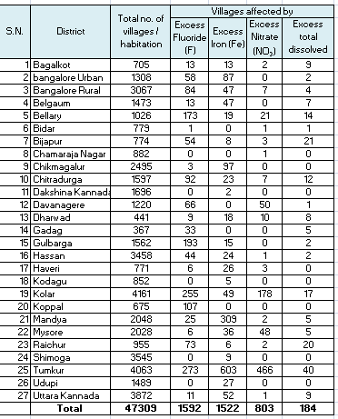
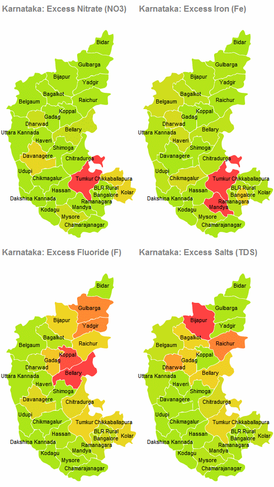
The data shows the number of villages affected with excess fluoride, nitrate, iron, and dissolved salts. When these villages are grouped together, it is easy to see which district has the highest levels of contamination. You can use more in-depth data and tools to give a better context to the data than the simple numbers.
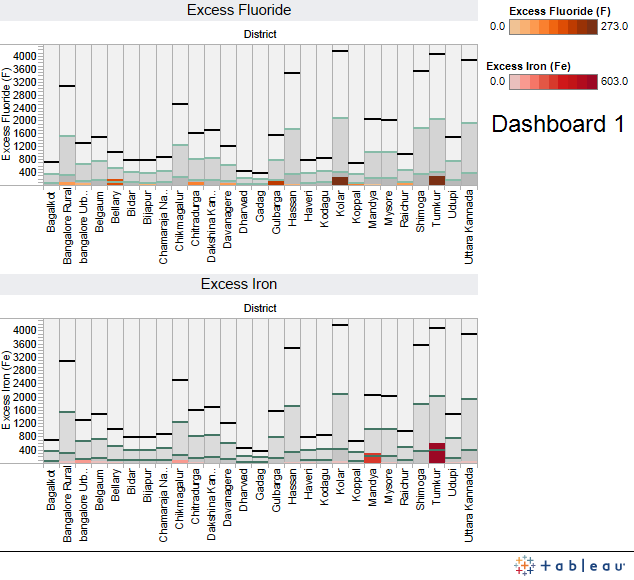
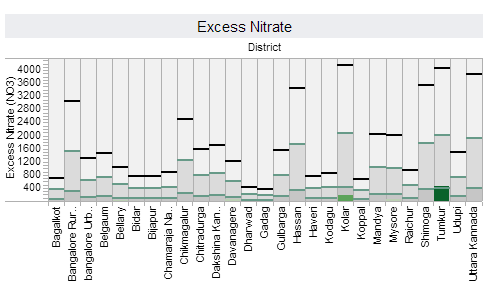
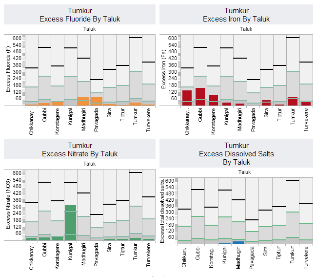
For instance you can use Tableau Public to make graphs and charts in a different way.The top black line is the total number of villages/habitations in a district. The green lines are marking the 10% and 50% points (so 10% of the total villages). The bars show the number of affected villages with excess contaminates. The data provided is Taluk level so we can do a few charts comparing across the Taluks to see which ones are the most affected.Again there is no sample size information so we are comparing the sample number affected by the total village and habitation information.
