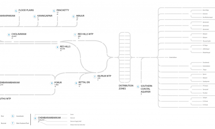
Chennai city base map
Objective
To visualize the water quality of Chennai over its existing water supply infrastructure map.
Roadblocks
- Map of water supply system was found with relative ease, but was surprisingly illegible and filled with details of little relevance.
- Maps do not carry a time stamp, so it is difficult to verify the information they present.
Need for reference map
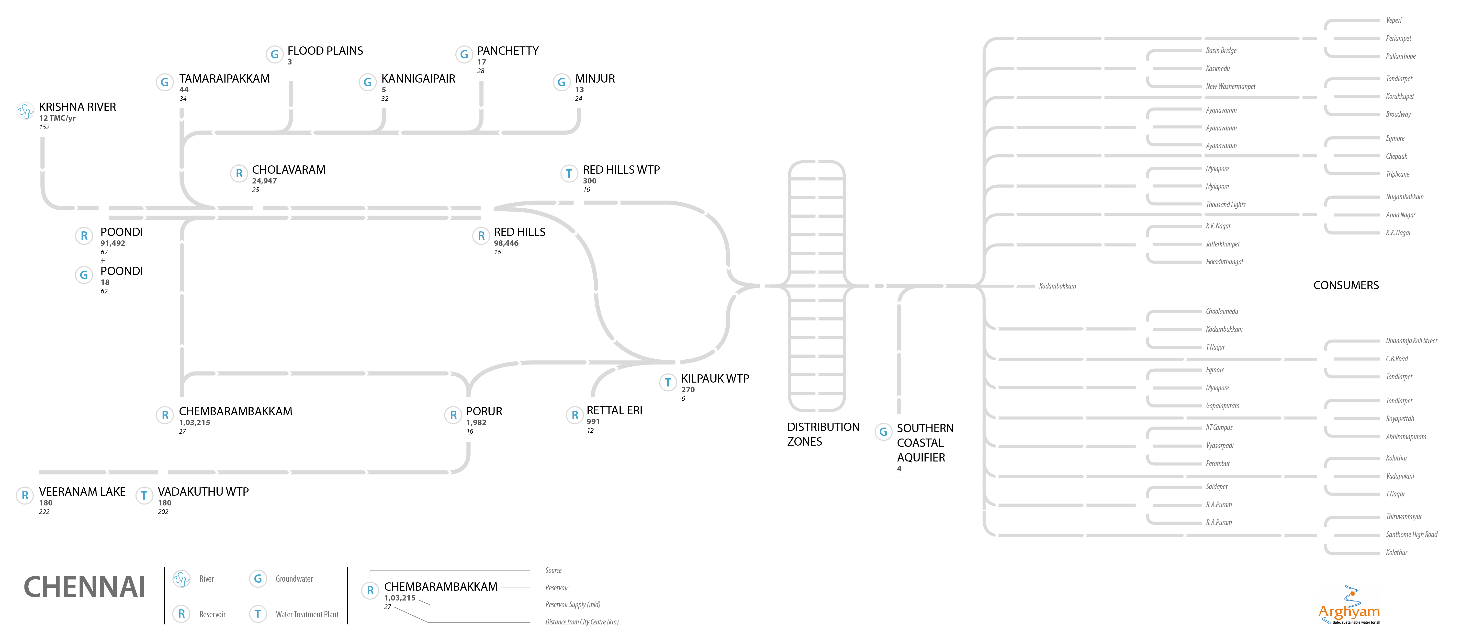
It was necessary to create a good reference map over which the data for water quality could be traced. Excessive details such as the road network of the city, or landmarks such as parks and important buildings needed to be weeded out. However, since the data was closely-linked with different locations around the city, it was necessary for the visualisation to retain some geographical relevance.
Chennai base map
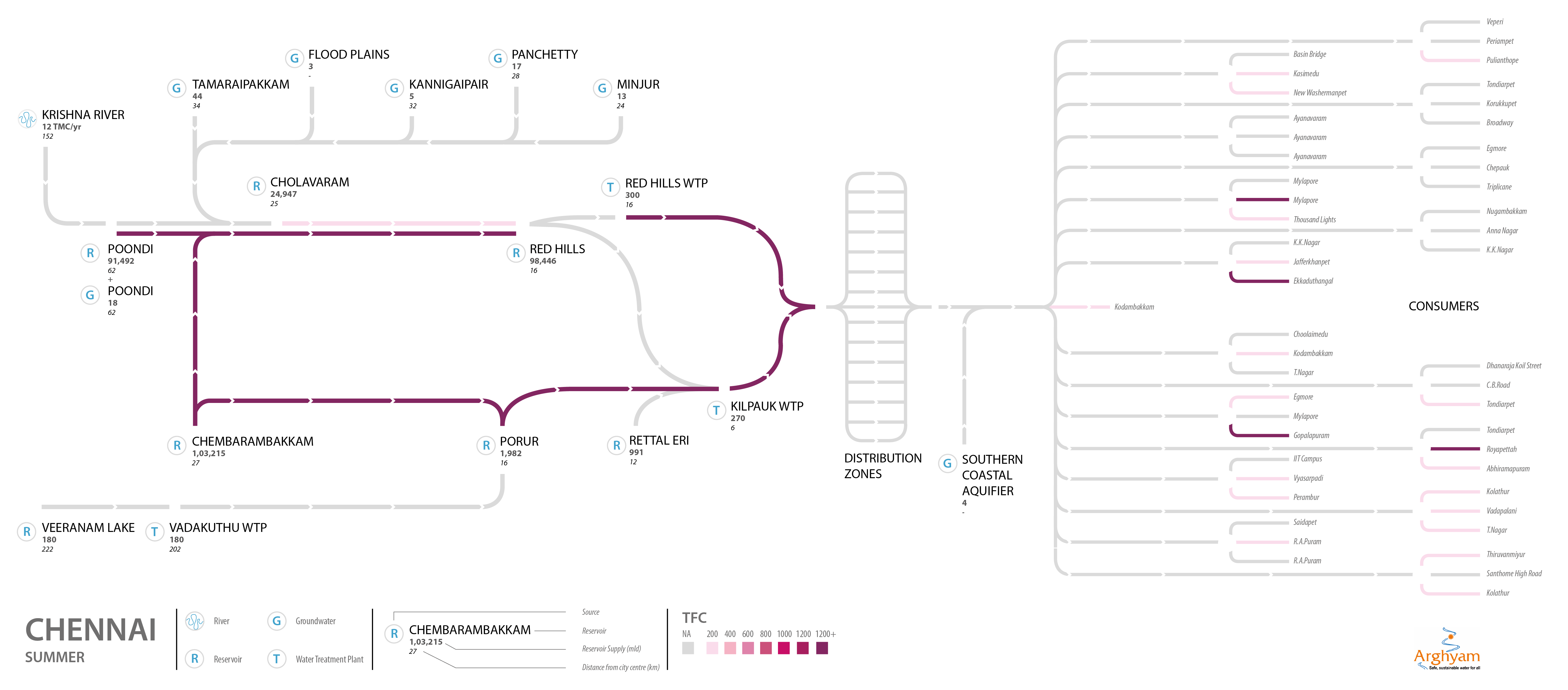
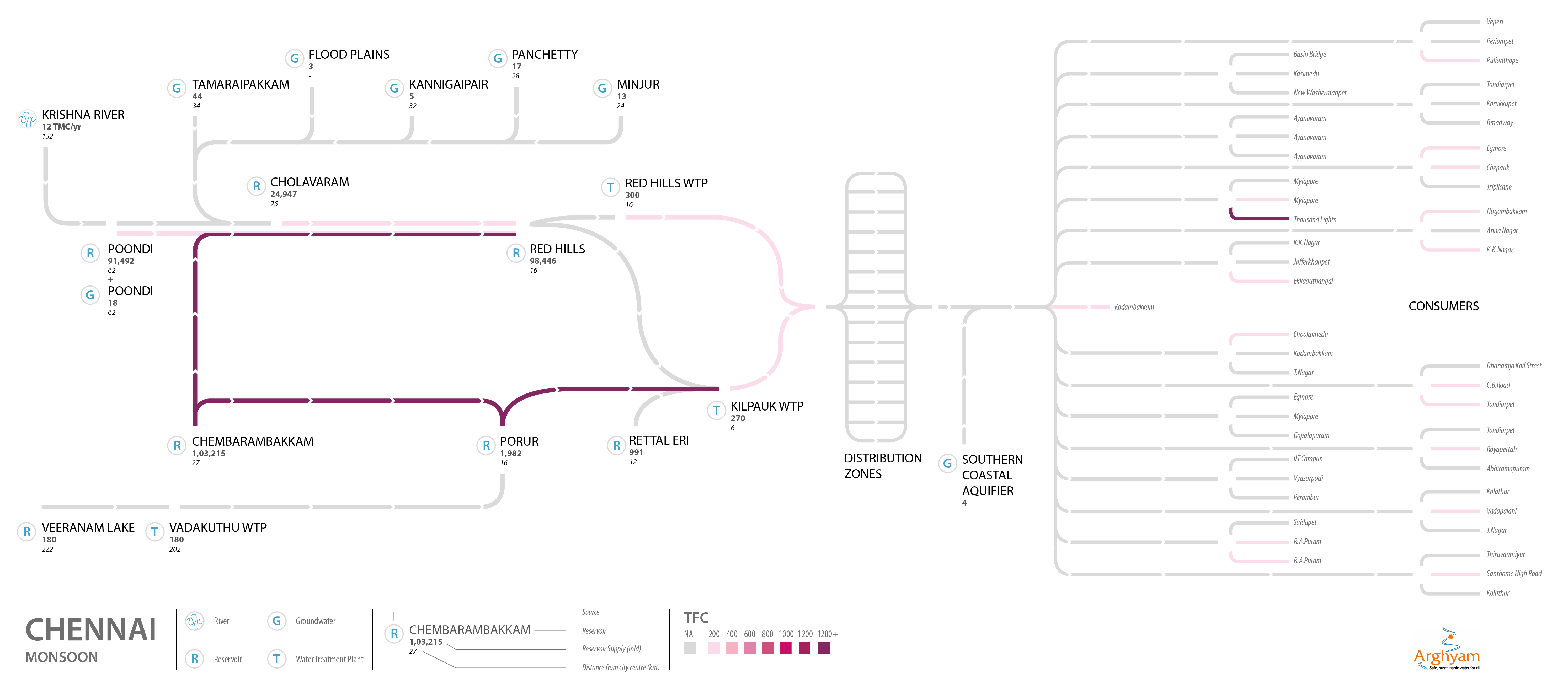
- Various water bodies like reservoirs, lakes, treatment plants, tanks etc. were marked.
- Each body was connected to the successive one in the supply chain by a coloured line.
- Line represents quality of water flowing from the former body to the latter.
- Darker the colour, the higher the contamination.
- Arrows in white, running along the lines, trace the flow of the water.
- Grey line denotes that data for that section was not available.
- Source of water (surface or ground) was denoted alongside the name of every reservoir.
- Under the name of the reservoir, its capacity (volume) and distance from the centre of the city was labelled.
Chennai data collation
- NEERI report for Chennai was thorough and sufficed to create the map.
- Report clearly listed surface & ground sources of water distinctly.
- Network of channels and pipelines was corroborated with the CDP produced for JnNURM.
- Extensions to the existing service was also added to the network map.
Issues faced
- Spelling of names, caused difficulty in locating them on a geographical map.
- Revisions needed to be made to keep visual simplicity without compromising representation of water flows.
Methodology used
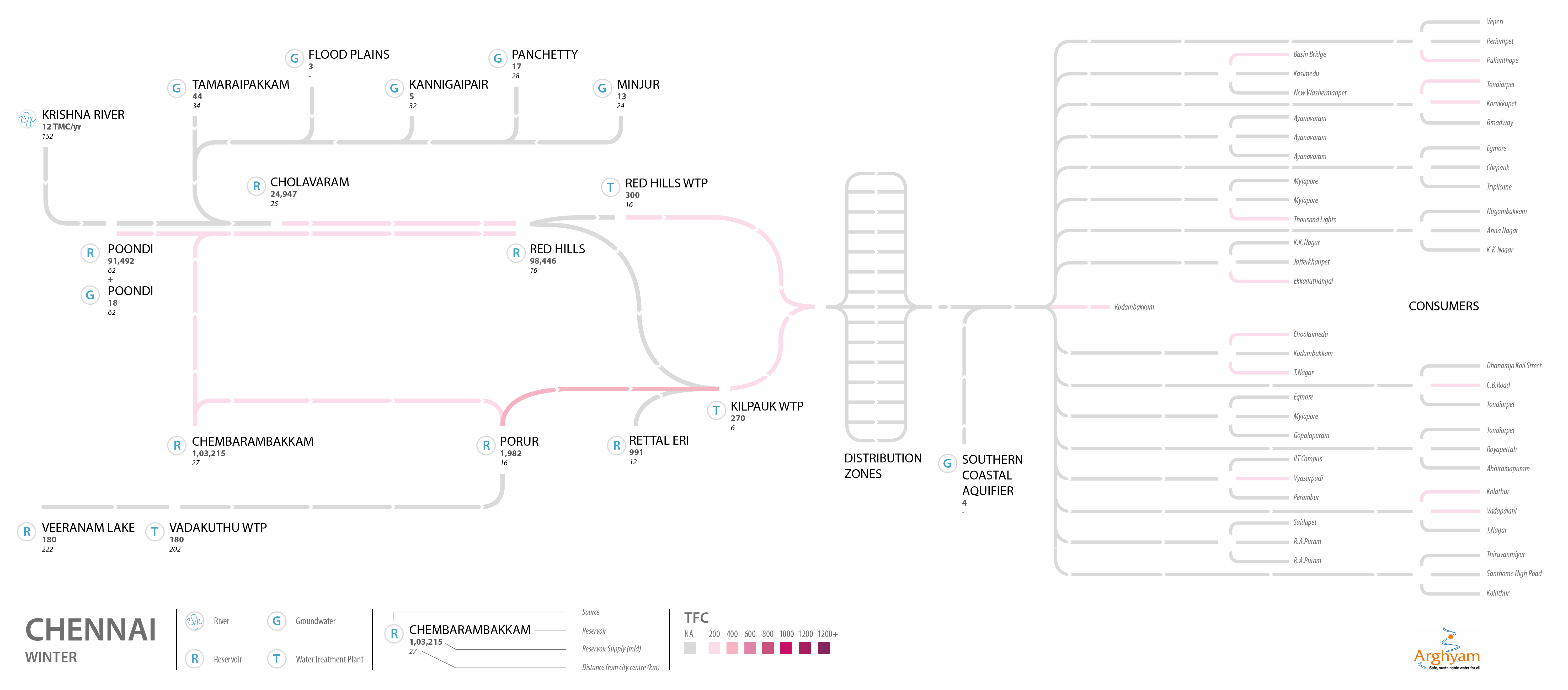
- Visualizations were produced using information primarily from NEERI reports.
- Report information was corroborated with additional sources such as water governance boards and government reports, and changes were made accordingly.
- Relative distances were mapped, taking certain liberties. Distance calculators were used to approximate distances.
What do the maps tell us
- Total Faecal Coliform is a problem in Chennai.
- People should boil their water.
- Contamination is still there after the water is treated.
Inconsistencies
NEERI report
- Revealed inadequacies in information provided when corroborated with other/recently updated sources.
- Reports followed a structure in presenting their findings, but the level of information within each section varied from city to city. This made it difficult, at times, to work with it.
Maps*
- Were designed to be simple so that they may invite the reader to have a conversation about the data and its revelations.
- Glaring lack of data became increasingly apparent once the mapping began.
- Putting together such a map was riddled with problems of availability and accuracy of data.
* Done by Tejas Panda, Consultant with IWP
Post By: NishaT
Topic
Sub Categories
Regions